
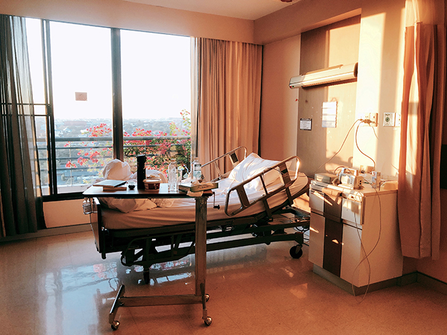
I went to the hospital a couple day ago and I feel that I stayed there for 8 days rather than 4 days. The reason is that I wake up all day all night. During my stay, I recognized interesting things in the hospital while I slept on the bed. There are head lamp, heart rate monitor and control panel of the patient bed.
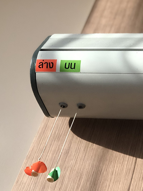
The head lamp over the bed was designed into the light direction – top and down lamp. There are two color stickers on the pulling switches. The green one is for the top lamp so the lamp will shine to the ceiling. On the other hand, the down lamp is for reading the book or seeing patients when the doctor visited. You can see the first picture that the lamp hanged over the bed. The reason that they use the string instead of the normal switch because they want patient to pull the switch down. In fact, it is still difficult to pull because the string is too short. For the confusing part, users do not know that the left switch is for top or down lamp if they do not place the sticker on. This is the classic problem of switches and create a human error easily.
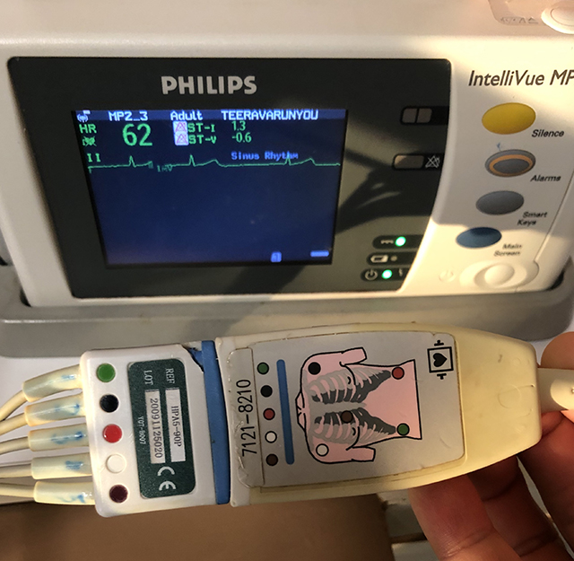
The next product is a good interface of the way that nurses can setup the electrodes on patient and the way to disconnect the cables by themselves. As you can see that there is a map of chest that has 5 dots with brown, white, red, black and green respectively. The cable will connect to the monitoring machine that can do the remote monitoring. Those machine is quite big if you would like to carry it to toilet (it is impossible for me to carry big machine). As a result, the cable can be plug and unplugged by patients. The way they do is to match the color of cable to the labels of lung. If the color matches together, it means that you connect the right cables.
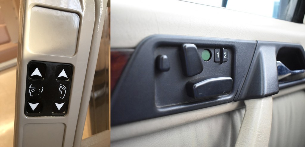
Coming to the last example, the control panel of the bed that has a symbol of head and feet. The head is for adjusting the inclination of the head while the feet is used for the lower part of the bed. Now you can see that there are four arrows. It looks a simple control but it is not natural mapping with the bed. Since the angle of adjustment is a radius more than the up and down itself. Let’s see how the Mercedes Benz seat control solves this kind of problem. The way they do is to use the seat metaphor. By making the 3D buttons, users are able to adjust the seat according to their direction. Moreover, the preset of seat angle should be designed to customize the bed adjustment so the patients do not need to setup the same angle all time.
From my perspective, you can evaluate how the designers’ thinking and how they solve the problem by using them. It makes me think how to use and figure out other example that can tackle this kind of design problem.
